

What is Flex In CSS? A Complete Guide to Mastering Flexbox.
CSS Display Flex: A Complete Guide to Mastering Flexbox
Introduction
In modern web design, creating flexible and responsive layouts is essential. CSS Flexbox, short for Flexible Box Layout, is a powerful tool that allows developers to design dynamic and adaptive layouts effortlessly. This guide will walk you through everything you need to know about display: flex, including its properties, usage, and best practices.
What is CSS Flexbox?
CSS Flexbox is a layout model designed to align items efficiently in a container. It enables flexible item placement along the main and cross axes, making it ideal for responsive design. Unlike traditional layout methods (float, inline-block, table), Flexbox is more intuitive and easier to manage. Flexbox is a layout method for arranging items in rows or columns.
Why Use Flexbox?
- Simplifies complex layouts
- Eliminates the need for float and positioning hacks
- Ensures responsive and adaptive design
- Provides powerful alignment and spacing options
CSS Flexbox Components
- Flex Container – the parent (container)
<div>element - Flex Items – the items inside the container
<div>
How to Use Display Flex
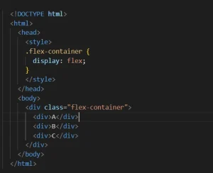
To use Flexbox, apply display: flex to a container element. This makes all its direct children flexible items.
Basic Example
Understanding Flexbox container Properties:
- flex-direction
- flex-wrap
- flex-flow
- justify-content
- align-items
- align-content
1. flex-direction Properties:
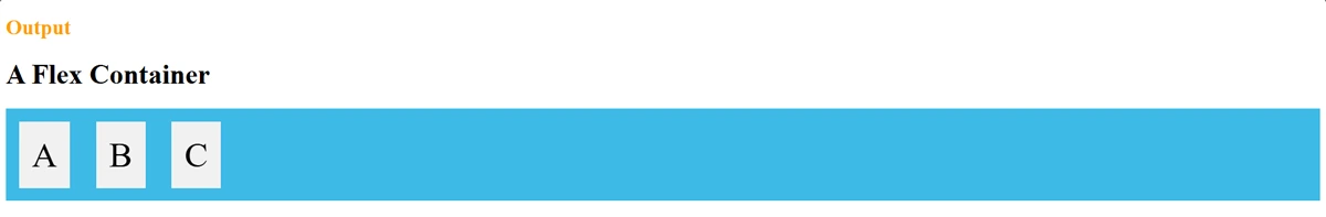
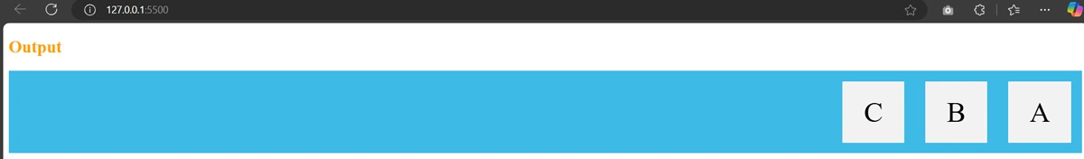
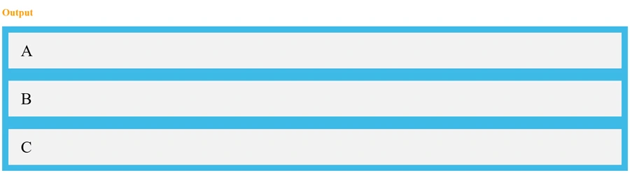
row(default) – Items are placed in a row from left to right.row-reverse– Items are placed in a row from right to left.column– Items are placed in a column from top to bottom.column-reverse– Items are placed in a column from bottom to top.
Example: row property- It displays the flex items horizontally.
.flex-container {
display: flex;
flex-direction: row;
}
Example: row-reverse property – It displays the flex items horizontally from right to left.
.flex-container {
display: flex;
flex-direction: row-reverse;
}
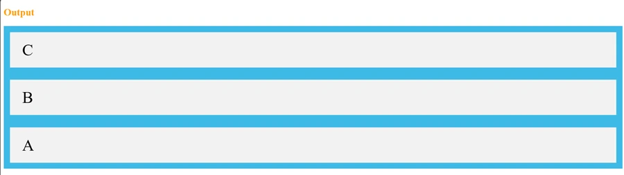
Example: Column property – Its displays the flex items vertically from top to bottom.
.flex-container {
display: flex;
flex-direction: column;
}
Example: Column-reverse property – Its displays the flex items vertically from bottom to top
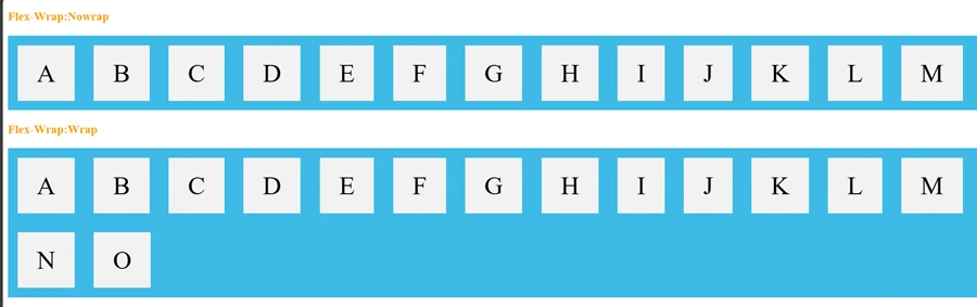
2. flex-wrap Properties:
Controls whether flex items wrap onto multiple lines.
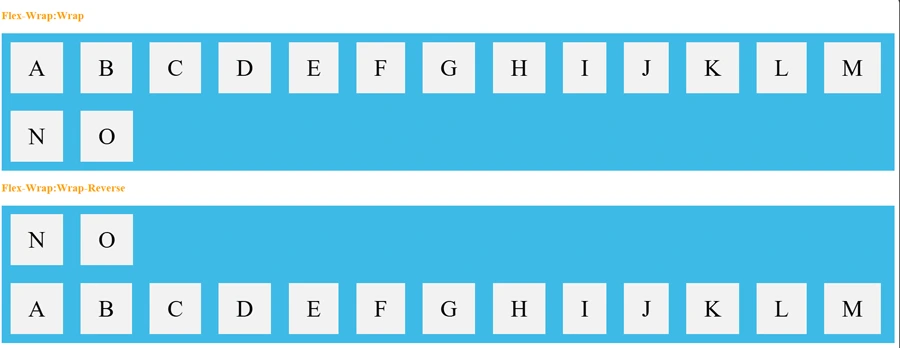
nowrap(default) – Items remain in a single line.wrap– Items wrap onto new lines if needed.wrap-reverse– Items wrap onto new lines in reverse order.
Example: nowrap property – the flex items will not wrap and this is default value
.flex-container {
  display: flex;
  flex-wrap: nowrap;
}
Example: wrap property – specifies that the flex items will wrap if necessary. Controls whether flex items wrap onto multiple lines.
.flex-container {
  display: flex;
  flex-wrap: wrap;
}
Example: wrap-reverse property – specifies that the flex items will wrap if necessary in reverse order
.flex-container {
  display: flex;
  flex-wrap: wrap-reverse;
}
3. flex-flow Properties:
It is a shorthand for flex-direction and flex-wrap. It defines both properties in a single line.
Possible Values:
flex-direction |
flex-wrap |
Example |
|---|---|---|
| row | nowrap | flex-flow: row nowrap; |
| row | wrap | flex-flow: row wrap; |
| row | wrap-reverse | flex-flow: row wrap-reverse; |
| row-reverse | nowrap | flex-flow: row-reverse nowrap; |
| row-reverse | wrap | flex-flow: row-reverse wrap; |
| row-reverse | wrap-reverse | flex-flow: row-reverse wrap-reverse; |
| column | nowrap | flex-flow: column nowrap; |
| column | wrap | flex-flow: column wrap; |
| column | wrap-reverse | flex-flow: column wrap-reverse; |
| column-reverse | nowrap | flex-flow: column-reverse nowrap; |
| column-reverse | wrap | flex-flow: column-reverse wrap; |
| column-reverse | wrap-reverse | flex-flow: column-reverse wrap-reverse; |
Example:
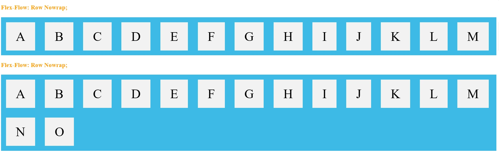
-
Items go left to right in
flex-flow: row nowrap; -
Wrap to next line if needed in
flex-flow: row wrap;
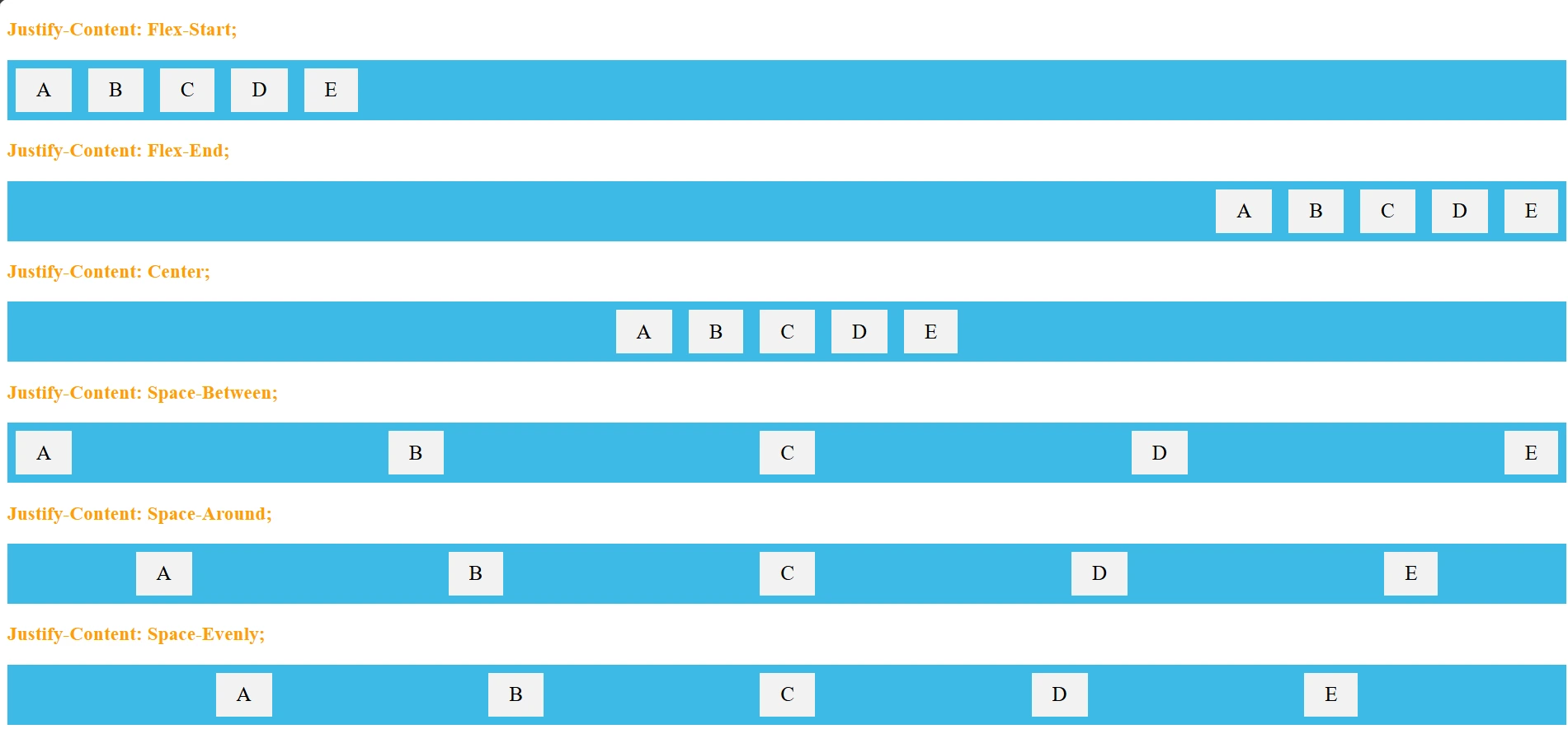
4. justify-content Properties:
Aligns items along the main axis.
flex-start– Items align to the start of the container.flex-end– Items align to the end of the container.center– Items align at the center.space-between– Items are evenly spaced with no gaps at the edges.space-around– Items have equal space around them.space-evenly– Items are evenly distributed with equal space between them.
Example: flex-start property – the flex items at the beginning of the container and its the default value.
Example: flex-end property – the flex items at the end of the container
Example: center property – the flex items at the center of the container
Example: space-between property – the flex items space between them of the container
Example: space-around property – the flex items space around them of the container
Example: space-evenly property – the flex items equal space around them of the container
Syntax:
.flex-container{
display: flex;
justify-content: value;
}
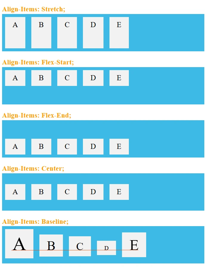
5. align-items Properties:
this is used to align the flex items when they do not use all available space on the cross-axis (container)
flex-start– Items align to the start of the cross axis.flex-end– Items align to the end of the cross axis.center– Items align at the center of the cross axis.baseline– Items align based on their text baseline.stretch(default) – Items stretch to fill the container.
Example: flex-start property – the flex items at the top of the container
Example: flex-end property – the flex items at the bottom of the container
Example: center property – the flex items at the middle of the container (vertically)
Example: baseline property – the flex items at the baseline of the container. Text within each item aligns based on its font baseline (useful with different font sizes).
Example: stretch property – stretches the flex items to fill the container and its the default value.
Syntax:
.flex-container{
display: flex;
align-items: value;
}
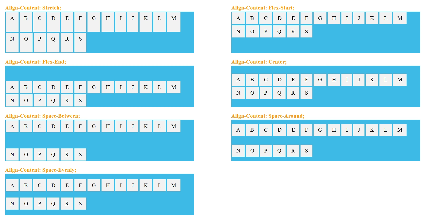
6. align-content Properties:
Aligns multiple rows of flex items.
flex-start– Rows align at the start of the container.flex-end– Rows align at the end of the container.center– Rows align at the center of the container.space-between– Rows are evenly distributed, with no space at the edges.space-around– Rows have equal space around them.stretch(default) – Rows stretch to fill the container.
Example: flex-start property – the flex lines are packed toward the top of the container
Example: flex-end property – the flex lines are packed toward the bottom of the container
Example: center property – the flex lines are packed toward the center of the container
Example: space-between property – the space between the flex lines are equal, but the first item is flush with the top edge of the container, and the last item is flush with the bottom edge of the container
Example: space-around property – the space between the flex lines are equal, but the space before the first item and after the last item is set to half of the space between the flex lines.
Example: stretch property – the flex lines stretch to take up the remaining space of the container and this is default value.
Syntax:
.flex-container {
display: flex;
flex-wrap: wrap;
align-content: value;
}
Notes: Difference Between align-items vs align-content
| Property | Use Case | Applies To |
|---|---|---|
align-items |
Aligns items on one line | Single line |
align-content |
Aligns lines of items | Multi-line |
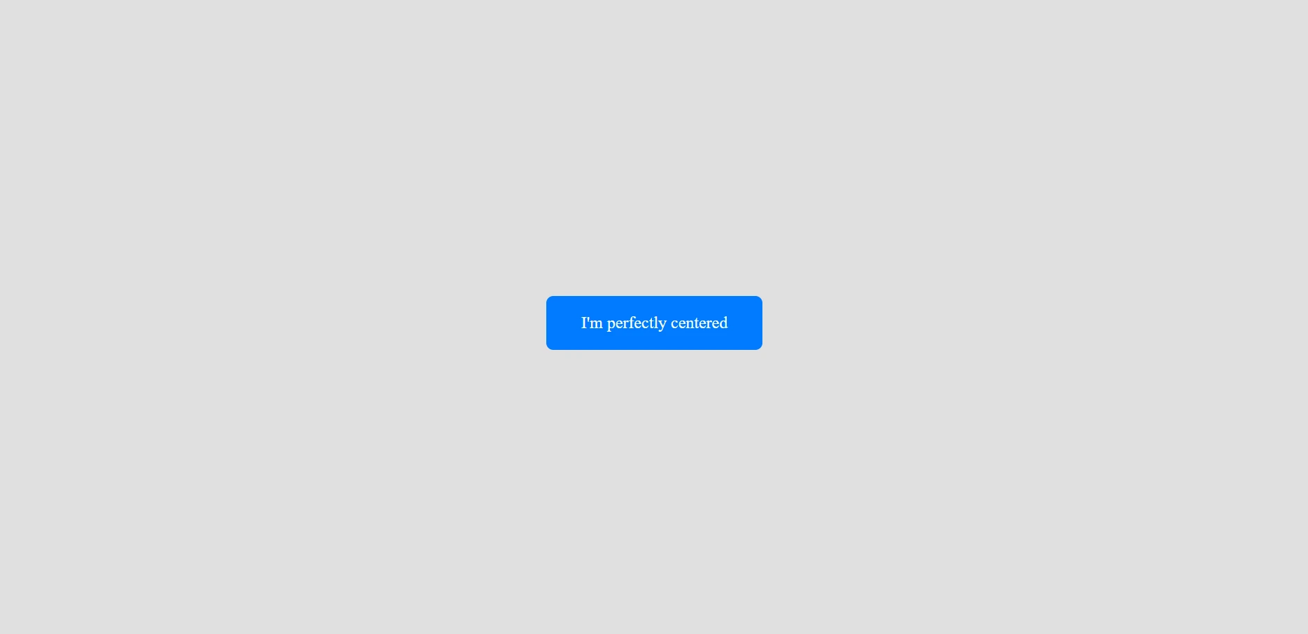
Perfect Centering in flex container:
To achieve perfect centering (both horizontal and vertical) using Flexbox, you can use the combination of:
-
display: flex -
justify-content: center(horizontal) -
align-items: center(vertical)
Example:
<div class=”flex-container”>
<div class=”centered-item”>I’m perfectly centered</div>
</div>
.flex-container {
display: flex;
justify-content: center; /* Center horizontally */
align-items: center; /* Center vertically */
height: 100vh; /* Full viewport height */
background-color: #f4f4f4;
}
centered-item box appear exactly in the center of the screen.
Understanding Flexbox Items Properties:
Flex items are the building blocks inside a flex container. They inherit layout behavior based on the Flexbox model, which allows responsive alignment, distribution, and sizing of items without using floats or positioning hacks.
What Elements Become Flex Items?
Only direct children of a flex container become flex items. Nested elements deeper than the first child level do not become flex items unless their parent is also a flex container.
The Flex Items properties are:
orderflex-growflex-shrinkflex-basisflexalign-self
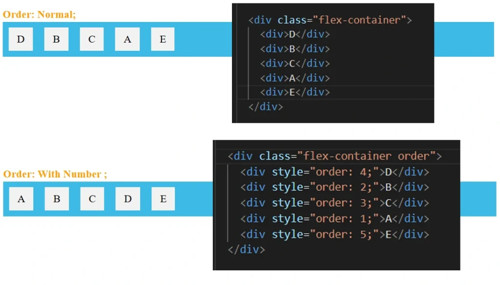
Example: order property – its specifies the order of the flex items inside the flex container. The order property can change the order of the flex items. The value must be a number.
Example: flex-grow property – Defines how much a flex item should grow relative to others items. A higher value means the item takes up more space. The value must be a number, default value is 0.
Example: flex-shrink property – Defines how much a flex item should shrink if space is limited. A higher value makes the item shrink more than others. The value must be a number, default value is 1.
Example: flex-basis property – Specifies the initial size of a flex item before any growing or shrinking. This sets a starting width/height.
Example: flex property – A shorthand for flex-grow, flex-shrink, and flex-basis.
Example: align-self property – Allows an individual flex item to override the align-items property of the container.


